I consider myself fortunate that I don’t have to pack up every inch of my classroom at the end of each school year — I come back in the fall and things are (more or less) where I left them.
Of course, this can be dangerous as well. I have learned the hard way what happens when bad layout or design hits your classroom. Two years ago I was constantly reaching behind a short cabinet to get to my ethernet jacks, when I finally realized I could just shift the cabinet over. Duh.
Here are a few design choices I make in my room, and how I intend for it to influence its use:
- The schedule for Lit Lab Tutors goes on the inside of my door — that way as I catch kids leaving class, I can quickly point them towards a Lit Lab appointment and say who will be expecting them.
- The vocabulary list goes right next to the clock. Hopefully student eyes don’t ignore it.
- The blank front wall to the right of my whiteboard has become the Advisory gallery. Two years ago I tried posting essential questions for each unit there, and often forgot to update them. Hopefully the advisees are getting a prime spot???
- School posters are squeezed into narrow space — they’re visible, but they’re not hogging wide wall space that could be used to display student work.
- The journal instructions are posted on the outside *and* inside of the cabinet door — because I realized that that door is usually open as kids retrieve and return their journals.
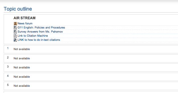
This year, I’m also making a major change in how I organize my courses online. Last year, the top of each Moodle page looked roughly like this:
A few key links up top, but then so many “Not available” sections I had closed to students! Ouch.
This year, each class brainstormed some expectations on the first day — something that could easily end up a dusty corner poster. This year, I decided to make their ideas live as straight text at the top of their Moodle page. Behold:
 I don’t know if this will actually lead to more awareness on the part of the students — and I recognize the list is not comprehensive. However, at the very least I think it displays what I value — and that’s their thoughts. These expectations were all brainstormed on paper, and then students picked the top 3-4 from each prompt.
The policies and procedures? That’s there too, but you have to click through. There’s only so much that fits on the first screen. I am thinking hard about what kids should see first and what message that sends.

Pingback: Laughter in the Classroom | Impulsive Teaching